Designing the Figure Notation
The three states of Tetriamancy were conceptually settled before their notation was.
The difficulty was not finding three symbols that could represent Manifest, Liminal, and Latent in isolation. The symbols also had to work when four of them were stacked into a figure, repeated throughout a fifteen-position chart, written quickly by hand, and reproduced using different pens, pencils, tablets, fonts, and screen sizes.
The notation therefore developed through experimentation rather than being derived from a single symbolic scheme.
Several concerns kept recurring:
- the three states needed to be distinguishable at a glance;
- a four-part figure could not become a dense cloud of marks;
- the notation should remain reasonably fast to write;
- there should be some visible continuity with geomancy;
- ideally, the values 1, 2, and 3 should remain easy to remember;
- the symbols should suggest their states without requiring that every detail be explained;
- and, most importantly, sloppy handwriting should not destroy the distinction between states.
The eventual notation emerged largely by discovering what didn’t satisfy all of those requirements.
The first problem: too many marks
One early approach stayed relatively close to geomancy by constructing each state from groups of short strokes or separated marks.
Conceptually, something like:
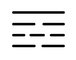
The problem became obvious when the marks were stacked.
A Tetriamantic figure has four rows. If every row is itself composed of several small marks, the figure stops being recognized as a shape and starts becoming something that has to be decoded.
The notation was technically readable, but visually expensive.
That became an important criterion:
A figure should be recognized before it has to be counted.
Circles, triangles, and the problem of handwriting
A circle seemed like a natural primitive. It is simple, historically compatible with dot-based geomantic notation, and easy to reproduce.
Triangles were initially attractive as a contrasting state:
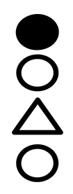
or:
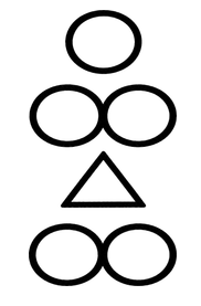
A triangle also seemed particularly appropriate for manifestation. It is directional, angular, and visually active in a way that a circle is not.
On paper, however, this distinction proved less reliable than it appeared on a screen.
Depending on the writing utensil, size, speed, and pressure, small circles and small triangles could begin looking surprisingly similar. A hastily written triangle might become rounded; a hastily written circle might become angular.
The triangle also carried a semantic problem. It looked too active. Whenever it was assigned to Latent, its visual character fought its intended meaning.
That was enough to discard triangles entirely.
The notation needed distinctions that survived bad handwriting rather than distinctions that worked only when carefully drawn.
Trying to make 1, 2, and 3 visible
Another strong consideration was the numerical mnemonic.
Tetriamancy assigns:
- 1 = Manifest
- 2 = Liminal
- 3 = Latent
It seemed desirable for the notation itself to somehow preserve this progression.
One possibility was literal counting:
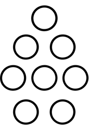
This had several advantages.
The second state in particular was promising. The connected pair:
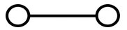
looked like a small dumbbell and naturally suggested betweenness, relation, or transition.
It also remained visibly related to the traditional geomantic double point:
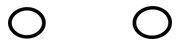
but the connecting line made it into a single Tetriamantic glyph.
The difficulty came with the third state.
Three circles:
were perfectly logical, but they reintroduced the original problem: more marks meant more visual clutter.
The notation was beginning to optimize for arithmetic rather than recognition.
Equal width versus a consistent symbolic vocabulary
Another experiment tried to make all three states occupy approximately the same horizontal space:
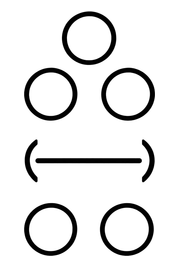
The third glyph here should be imagined as a long oval or capsule rather than a literal rectangular bracket.
This solved one problem very effectively: silhouette.
The three states looked radically different from one another, and each occupied roughly the same visual area.
But the set introduced a different problem.
The first two symbols were constructed from the same vocabulary: point + horizontal extension
The third suddenly introduced: containment
The oval could be given an interpretation. It might represent latent potential contained within a field, for example. But that interpretation felt added afterward rather than arising naturally from the graphical system.
The notation was readable, but its grammar was inconsistent.
I also considered variants such as:
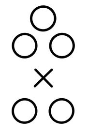
These were visually distinctive, but each new primitive created another thing that had to be justified. The X, for example, already carries meanings of crossing, negation, intersection, and division that Tetriamancy did not necessarily need.
The search increasingly became one for fewer graphical primitives, not more.
The dumbbell was the important discovery
The most useful symbol to emerge from the experiments was not actually the final system as a whole.
It was this:
Once this was treated as Liminal, it suggested a different way of thinking about all three states.
Instead of asking: “How can the symbols visibly contain one, two, and three things?” the question became: “What can happen to the same basic point”
That shifted the design away from counting and toward topology.
A point could remain alone.
A point could project.
Two points could be connected.
From that came:
| State | Glyph |
|---|---|
| Manifest |  |
| Liminal |  |
| Latent |  |
The important feature is not simply that these three symbols look different.
They describe three different relationships between point and extension.
Latent: the unextended point
Latent became the simplest possible state.
The point exists, but nothing proceeds from it.
There is no connection, projection, or visible development.
It can therefore suggest something:
- potential,
- recessed,
- withheld,
- concealed,
- dormant,
- or present without yet being expressed.
The symbol does not attempt to draw “nothing.” Latency still receives a positive mark, which avoids the ambiguity between a deliberately latent row and a row that was accidentally left blank.
Manifest: the projecting point
Manifest uses the same point, but now something extends outward from it.
The point has entered into expression.
The horizontal strokes therefore gained an actual symbolic function rather than serving merely as decoration:
| State | Glyph |
|---|---|
| Latent | |
| Manifest | |
The second glyph can be understood as the first becoming active in its surrounding field.
This ultimately felt more appropriate than using a triangle to signify activity. Rather than assigning “activity” to an unrelated shape, manifestation becomes a transformation of the same primitive used for latency.
Liminal: extension between points
Liminal behaves differently from both.
Its extension does not radiate outward from one center.
It exists between two centers.
That made the symbol unusually compatible with the idea of liminality:
- relation,
- tension,
- mediation,
- passage,
- transition,
- suspension between poles.
The resemblance to the two points of traditional geomancy remains visible, but the connecting line changes their relationship. They are no longer merely two separate marks. They form one continuous glyph.
The final system
The resulting notation is:
| Value | State | Glyph |
|---|---|---|
| 1 | Manifest | |
| 2 | Liminal | |
| 3 | Latent | |
The numerical values are no longer represented by literally counting one, two, and three objects.
That was a deliberate compromise.
The attempt to make the notation visibly countable kept creating additional marks, and additional marks made the figures harder to recognize. The 1–2–3 correspondence remains a mnemonic, but the glyphs themselves prioritize meaning and legibility.
Their mnemonic becomes semantic instead:
- Latent — stands alone.
- Manifest — projects outward.
- Liminal — extends between.
Silhouette became more important than counting
This was probably the most important practical discovery in the process.
When several states are stacked:
they do not need to be counted.
The eye sees three different silhouettes:
A Manifest row is widest around its center.
A Liminal row terminates in points at either side.
A Latent row collapses to the center.
This makes an entire four-row figure much easier to apprehend as a single visual object.
The distinction also survived informal handwriting tests using thicker digital pens, where more delicate differences between circles, triangles, and dots had failed.
Continuity with geomancy without imitation
The final notation also preserves a useful degree of visual ancestry.
Traditional geomancy is immediately associated with arrangements of one and two points:
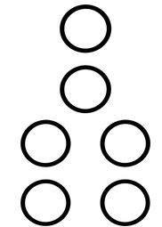
Tetriamancy does not reproduce that notation exactly, but neither does it abandon it.
Its glyphs still revolve around the point.
Most obviously:
| Notation | Glyph |
|---|---|
| Geomantic pair | |
| Tetriamantic liminal | |
The relationship is visible without requiring Tetriamancy to remain bound to binary notation.
This became preferable to inventing three wholly unrelated occult symbols. Tetriamancy is a reworking of geomancy; its notation benefits from looking as though it has grown from the same visual soil.
What ultimately decided the notation
The final symbols were not chosen because they were the most elaborate, the most esoteric-looking, or the most mathematically pure.
They survived because they answered several competing demands at once:
Semantic clarity.
The relationship between point and line carries some of the meaning of each state.
Visual distinction.
The three states have clearly different silhouettes.
Handwriting tolerance.
Their differences remain visible even when drawn imperfectly.
Economy.
No state requires a dense collection of marks.
Shared grammar.
All three are constructed from the same basic vocabulary of points and horizontal extension.
Geomantic continuity.
The point remains the fundamental visual unit.
Chart readability.
Four stacked states can be perceived as a figure rather than decoded as a tally.
The process therefore became less about discovering the symbol that perfectly represents Manifest, Liminal, or Latent and more about discovering a notation that could survive actual use.
The question that finally mattered was:
What can be written badly and still remain itself?
That proved a much better design criterion than asking what looked best when drawn perfectly.